

In yesterday’s New York Times, David Leonhardt shared a version of the following graph produced by Piketty, Saez, and Zucman as part of their Distributive National Accounts project.
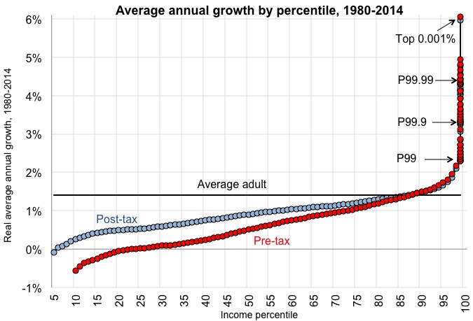
What the graph shows is that top incomes increased massively between 1980 and 2014, while the incomes of other groups grew much more slowly, with the vast majority of adults experiencing income gains below the national average.
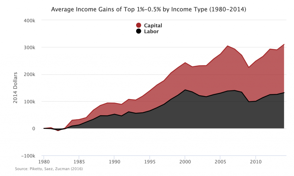
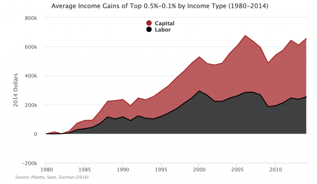
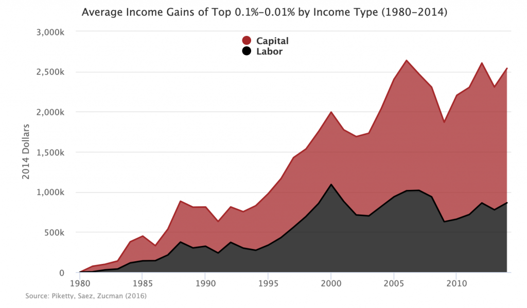
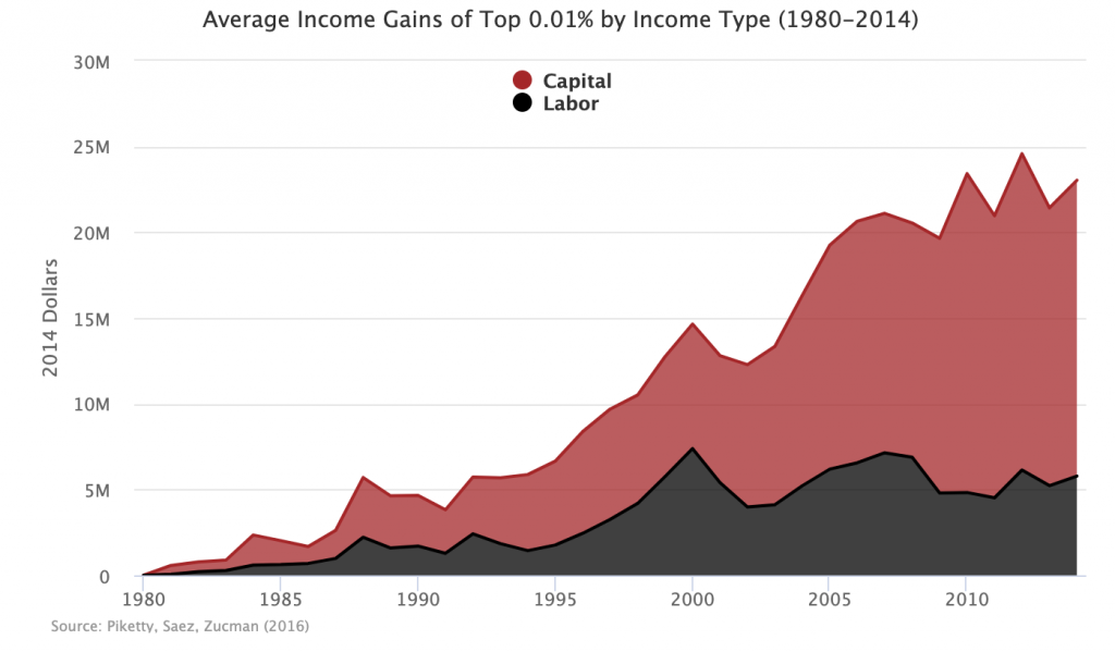
To supplement this graph, I have decomposed the income gains of the top 1 percent into capital and labor components. Capital refers to income received from owning assets: dividends from stock, interest from debt, and rents from real estate. Labor refers to income received from working: salaries and wages. What this decomposition shows is that the majority of income gains for the top 1 percent came from capital rather than labor. In fact, all top 1 percent income growth after 2000 came from capital.
This data underscores the point made in Monday’s featured post: if we care about inequality, we must confront capital.