

We are still continuing our coverage of the 2016 Survey of Consumer Finances. Below I show how wealth is distributed within a variety of demographic subgroups. What I find is that wealth is similarly distributed in every demographic subgroup. Wealth levels vary a great deal from subgroup to subgroup, but wealth distributions do not.
Age
The below graph shows how wealth is distributed in every age group.
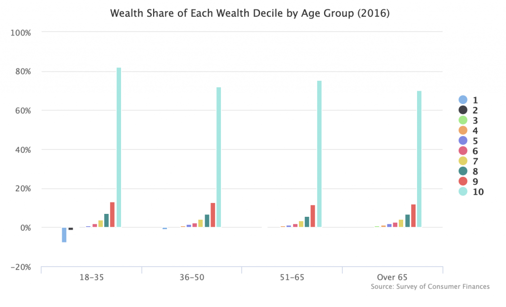
For ages 18-35, the top 10 percent (indicated here by the “10” bar) own 82 percent of that age group’s wealth. For 36-50, it is 72 percent. For 51-65, it is 75 percent. And for over 65, it is 70 percent.
Education
This is the same as the age graph, but using education groups rather than age groups.
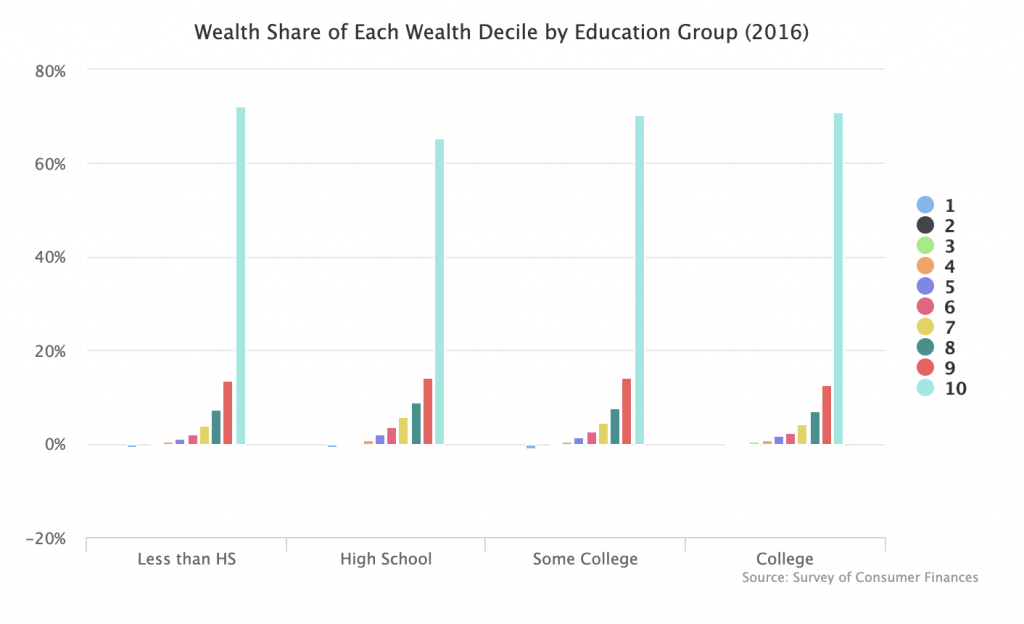
Across all education groups, the top 10 percent owns around 65 to 70 percent of the group’s wealth.
Race
Finally, we look at race. I have already written a post about this, but did not put all the figures together in one graph. So I do that here.
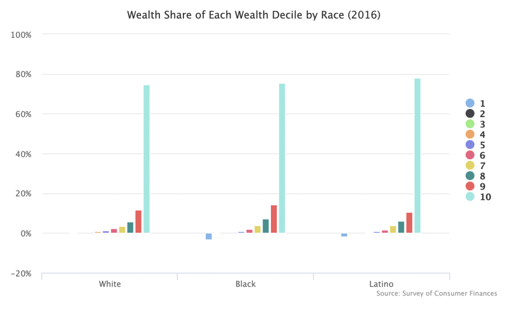
As you can see, wealth inequality is basically the same everywhere. The top 10 percent tends to own around 70 percent of the wealth. The next 10 percent tends to own around 10 to 15 percent of the wealth. And everyone else in a particular group owns a relatively negligible share of the wealth, with the bottom 40 percent typically owning nothing on average.
This suggests that the patterns of wealth inequality that we see in society are deeply embedded in the way our economic system works. If we want to break those patterns up and create a more egalitarian system, truly radical changes to how we own wealth will probably be necessary.