
The National Low Income Housing Coalition released its annual report about housing affordability last week. The headline is that housing is unaffordable to minimum wage earners in every state in the country.
NLIHC defines affordability as being able to pay the rent of the 40th percentile rental unit with 30 percent of the minimum wage. So, if the minimum wage is $7.25 (as it is federally), then the annual wage for a minimum wage earner is $15,080 and the monthly wage is $1,256.67. Thirty percent of $1,256.67 is $377. Thus, for housing to be affordable in an area under this measure, the 40th percentile unit would need to rent for $377 or fewer dollars.
The peculiarities of this measurement always raise a few eyebrows from those who pay close attention. This year, Jodi Beggs was among those calling foul. Why does the NLIHC use 30 percent of the minimum wage as the barometer of affordability? Why does it use the 40th percentile rental unit when you would expect a minimum wage earner to live in, say, the 10th percentile unit?
These objections have understandable answers. HUD considers families that spend more than 30 percent of their income on rent to be “cost burdened” and considers the 40th percentile rent in an area to be the “fair market rent.” Also, HUD only publishes the 40th percentile rents, meaning that is the figure the report authors have to work with.
But these answers still leave open a lot of interesting questions. Even if their measure of affordability is defensible, it would nonetheless be interesting to know: what does the 10th percentile rental unit charge? How affordable are units up and down the rental spectrum?
Hoping to answer some of these questions myself, I dug into the American Community Survey to produce the following figures. Note that, for these figures, I use the federal minimum wage and the rental distribution of the whole country. You could do this for individual states as well, but that would take more time than I want to devote to this.
Here is the rent level at each percentile. I cut it off at the 80th percentile because units above the 80th percentile rapidly escalate in price and throw the scale of the graph off (and are also somewhat irrelevant to the task at hand).
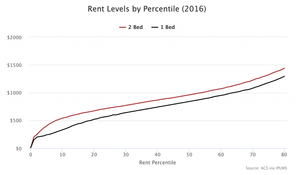
As you can see, the median 1-bedroom unit rents for $830 while the median 2-bedroom unit rents for $950. The 40th percentile unit rents at $740 and $865 respectively. The 10th percentile unit rents at $330 and $540 respectively.
Here is the same graph, but the vertical axis is now expressed in terms of percentage of the federal minimum wage.
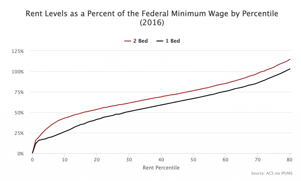
The 40th percentile rent requires 58.9 percent of the minimum wage for a 1-bedroom unit and 68.8 percent of the minimum wage for a 2-bedroom unit. At the 10th percentile, the rents are 26.3 percent of the minimum wage and 43 percent of the minimum wage respectively.
Finally, here is the same graph, but the vertical axis shows the hourly wage necessary to afford the rent without being “cost burdened,” i.e. to be able to afford the rent using only 30 percent of your labor income.
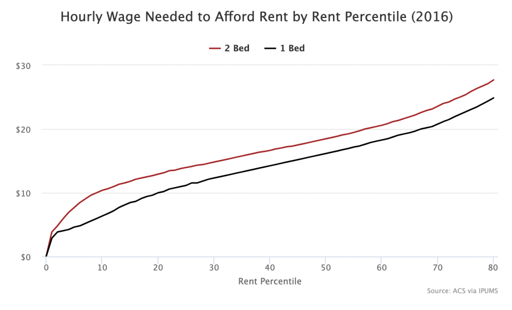
The 40th percentile unit requires a wage of $14.23 for a 1-bedroom and $16.63 for a 2-bedroom. At the 10th percentile, it’s $6.35 and $10.38.
Doing the same kind of calculations with the entire rent distribution basically confirms the headline argument of the NLIHC. It really does appear to be difficult to afford rent at the minimum wage, even at quite low percentiles of the rent distribution and even when looking at the entire country. Once you get past the weird rental values at the very bottom of the distribution (e.g. the $4 rent at the 0 percentile), you quickly run into units whose rents are so high that it would be hard to pay for them and still have enough money left over for your other consumption needs.
As I noted in my Huffington Post interview on this report, governments can take three steps to ensure low-wage workers can afford to rent housing: (1) build out an adequate supply of social housing, (2) increase wage floors, and (3) increase welfare incomes.