I spent a considerable amount of time in the run up to the release of the 2016 Survey of Consumer Finances thinking about how best to represent the overall racial wealth gap in a single illustration. The usual approaches and many other conceivable approaches have issues that have long bugged me.
Comparing white median wealth to black and Latino median wealth suffers from the problem of arbitrariness. What is so special about the 50th percentile, especially when dealing with a quantity like wealth that is so skewed towards the top? The middle quintile of white families owns about 3.7 percent of white wealth; the middle quintile of black families owns about 2.8 percent of black wealth; and the middle quintile of Latino families owns about 2.6 percent of Latino wealth. Median racial wealth gap figures are comparing segments of each racial group’s population that own almost none of that group’s wealth.
Comparing white mean wealth to black and Latino mean wealth is somewhat better because means include all of the wealth in each racial group. Indeed, as I indicated in a prior post, if I had to pick a single number to define the racial wealth gap, I would divide black and Latino mean wealth by white mean wealth. The problem with mean wealth however is that, by including all of the wealth in each racial group, it can obscure differences within each group’s wealth distribution.
One conceivable way of solving the problem with means without also running into the problems with medians is to compare black, Latino, and white wealth at every part of each group’s wealth distribution. So you can compare the black, Latino, and white first percentile, second percentile, third percentile, and so on.
The problem here is that if you compare them only by finding the absolute difference between the three races at each percentile, you end up with a visualization that looks mostly like a flat line hovering around zero up until you get into the higher percentiles. This is because of how much wealth is skewed towards the top of society. If you compare each percentile by dividing black and Latino wealth by white wealth at each percentile, you run into the problem of negative values creating screwy results in and around the bottom of the wealth distribution.
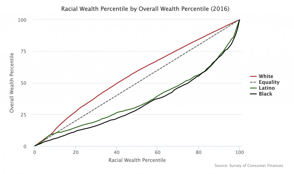
In an attempt to come up with a visualization that solves all these issues, I settled on the graph below, inspired by the way Branko Milanovic often likes to represent income inequality between countries. The graph might be somewhat bewildering at first glance (a negative no doubt), but it is not too difficult to explain.

On the horizontal axis you have the racial wealth percentile and on the vertical axis you have the overall wealth percentile. If there was no racial wealth inequality, then the white, black, and Latino lines would all map on to where the Equality dashed line is. But, as you can see, they don’t do that.
If you hover your cursor over the 50th percentile, you see the following values:
- White — 59.3
- Latino — 31.1
- Black — 28.8
What this means is that the 50th percentile white family sits around the 59th percentile of the overall wealth distribution; the 50th percentile Latino family sits around the 31st percentile of the overall wealth distribution; and the 50th percentile black family sits at the 29th percentile of the overall wealth distribution. If things were equal, the 50th percentile of each racial group would also sit around the 50th percentile of the overall wealth distribution.
Although I think this visualization is better than most others you see, it too has at least one issue. Near the top of the wealth distribution, each race’s line tends to converge back to the line of equality. This is because, even though there are large differences in wealth magnitudes in the top percentiles of each racial group, there are not large differences in rank order. Put another way, the 99th percentile black and Latino families have far less wealth than the 99th percentile white families, but they are still close behind 99th percentile white families in the wealth order.
That issue notwithstanding, if you had to represent the whole racial wealth gap in one illustration, I think this is the best way to do it.

