Every year the Census Bureau publishes the official poverty rate and the supplemental poverty rate.
The official rate groups all related people in a household into one unit, adds up all the cash income that flows into that unit (except tax credits), and then compares that income amount to a poverty line that varies based on the number of people in the unit.
The supplemental rate works similarly except that it takes the cash income concept from the official rate, adds cash-like benefit incomes and tax credits to it, and then subtracts taxes paid, child support paid, child care expenses, work expenses, and medical out-of-pocket expenses. The supplemental rate uses a poverty line that varies geographically and by the number of people in the family unit.
In addition to the official and supplemental rates, it can be useful to look at something called a relative poverty rate, which is more commonly used across the world. The relative poverty rate figures provided below are derived in the following manner:
-
- Each family’s income is determined by adding cash income, cash-like benefit income, and tax credits, and then subtracting taxes paid and child support paid. This is the same as the income concept used by the supplemental poverty rate except that I do not subtract child care expenses, work expenses, and medical out-of-pocket expenses, as those are not typically subtracted from income concepts elsewhere in the world.
-
- The income derived in (1) is equivalized by dividing it by the square root of the number of people in the family. So a four-person family whose income is $40,000 ends up with an equivalized income of 40,000 / √4 = $20,000. An equivalized income is assigned to every person in the survey.
-
- After assigning equivalized incomes in (2), I find the poverty line by taking the median equivalized income and dividing it in half. There is no geographic adjustment. Anyone with an income below 50% of the median equivalized income is determined to be in poverty.
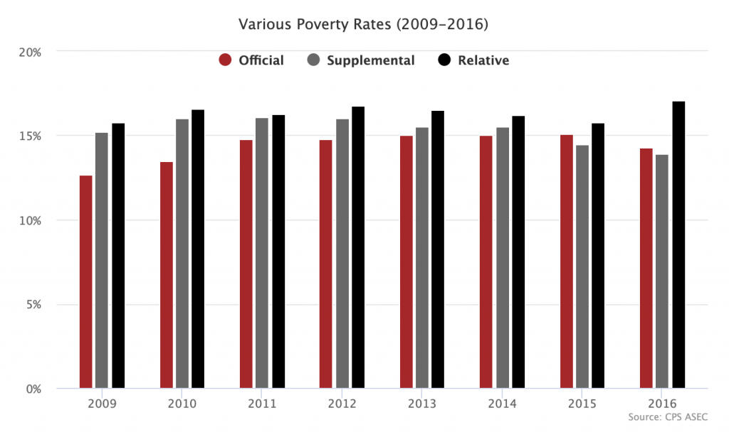
Using this method, here is the relative poverty rate for the last eight years, compared to the official and supplemental poverty rates in the same years.

The relative poverty rate is generally higher than the other rates and actually went up 1.3 points last year while the official and supplemental poverty rates declined.
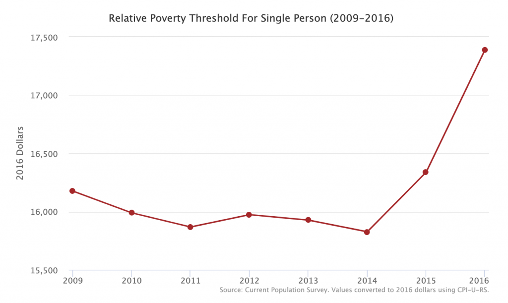
The next graph shows how much income a single person would have needed during each of the last eight years to be over the relative poverty line. To determine how much income families of other sizes would have needed, you can take the figures here and multiply them by the square root of the family size. So, for instance, a family of four will need double the income in this graph to be above the poverty line using this metric. Note that all of the dollar values are adjusted to 2016 dollars with the CPI-U-RS.

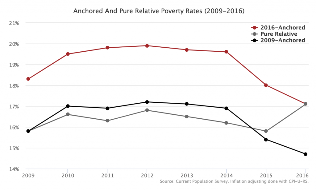
The final graph compares the pure relative poverty rate to two anchored poverty rates over this period. The pure relative poverty series is just the rates from the first graph above converted to a line graph. For the 2009 anchored poverty series, I take the 2009 poverty threshold from the second graph above ($16,176) and use that as the poverty line for all of the years in the series. For the 2016 anchored poverty series, I use the 2016 poverty threshold ($17,390) as the poverty line for all of the years in the series.

All three measures show the same basic trend until 2016 where the pure relative poverty line goes in the opposite direction of the other two. This is what you would expect given the second graph above where the poverty line shoots up in the last year due to a rise in the median income.

