Dana Thomson and friends put out a child poverty report earlier this week that was covered by Jason DeParle and David Leonhardt in the New York Times. I’ve already written one piece about the report. So has Scott Winship.
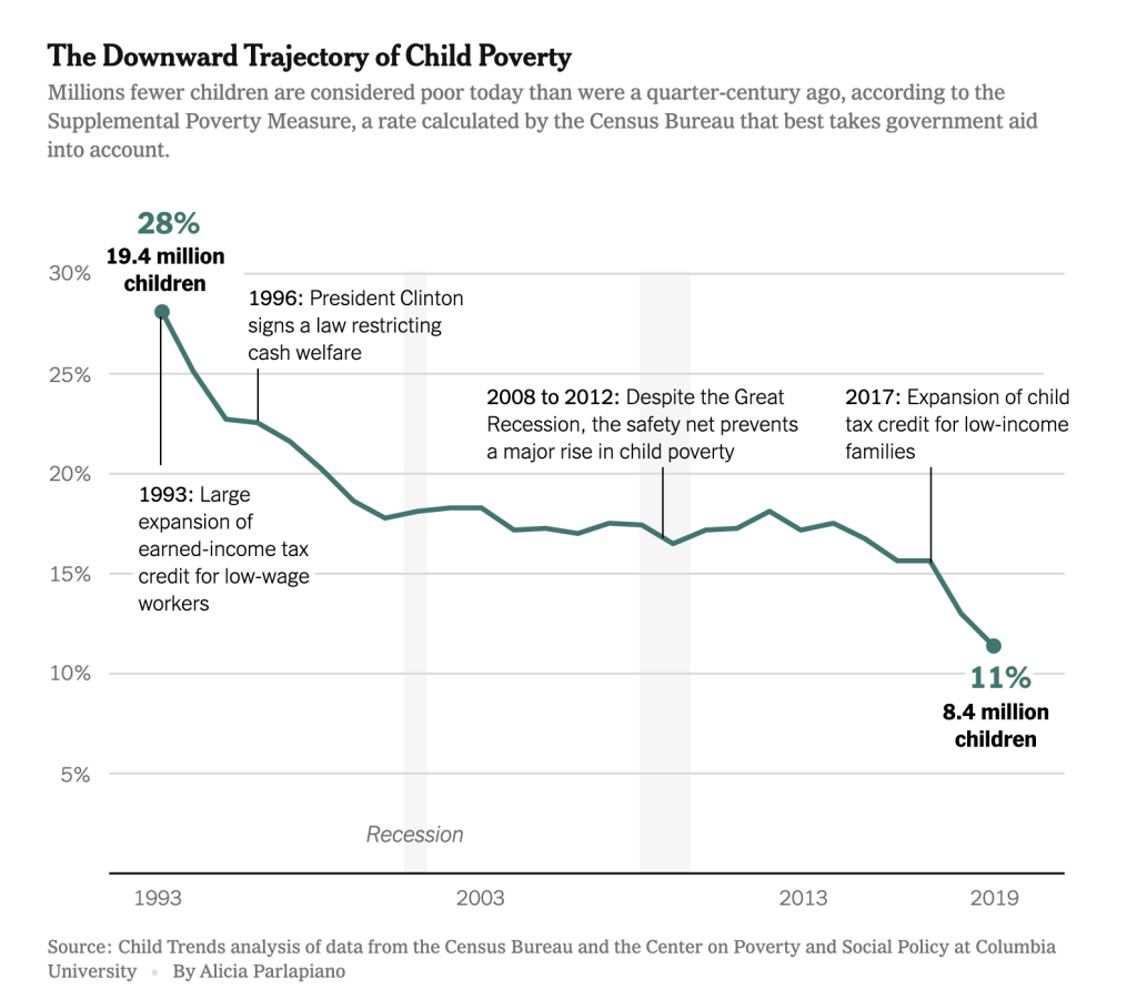
The centerpiece of Child Trends report is the claim that child poverty declined dramatically over the past few decades. The chart summarizing this looks like this development looks like this.

When I saw this chart earlier this week, it looked very strange.
The decline in the 1990s made sense as the employment rate and the EITC increased a lot in the 1990s (the EITC’s effect is massively overstated by shoddy data, but that’s not relevant here). The stagnation from 2000 to 2013 made sense. We had two recessions and employment dropped considerably. The slight decline in the mid-2010s also made sense as employment was starting to pick up again.
But the sharp drop in 2018 and 2019 was hard to understand. The labor market improved some but no more than in prior years.
The graphic here, following some language in the report, suggests that we had a huge drop in these years because of an expansion of the Child Tax Credit. But, for the poor, the CTC change in question increased the benefit from 15 cents for every dollar earned beyond $3,000 (up to a maximum of $1,000 of benefit) to 15 cents for every dollar earned beyond $2,500 (up to a maximum of $1,400 of benefit). This is not a huge increase and so it’s hard to see how it could have caused this decline.
The phase-in design of the CTC ensures that the poorest kids receive no benefit from the program. This is terrible in general but very convenient for our purposes here. If the CTC expansion really was driving this whole thing, then we should see an uptick of incomes around the 15th to 25th percentiles but not see one below that. Instead, when we graph the per-capita inflation-adjusted incomes of the 5th, 10th, 15th, 20th, and 25th percentiles of the child income distribution, we see this:
Here is the same graph but with the income of each percentile in each year presented as a percent of 2017 income.
Every single percentile has the same unusual income spike in 2018, including the 5th percentile kids whose family’s earnings are too low to benefit from the $400 CTC expansion.
In fact, we see this spike for the 1st, 2nd, 3rd, and 4th percentiles — i.e. the poorest 4 percent of kids — as well.
The first percentile kid went from decades of languishing around $0 of per-capita income to over $500 in a single year!
Nothing that happened in the economy in 2018 can explain this data. But something that happened at the Census can. In the mid-2010s, “the Census Bureau introduced redesigned income questions, followed by changes beginning in 2015 to allow spouses and unmarried partners to specifically identify as opposite- or same-sex.” These redesigned questions were studied for a few years, but they did not make it into the data series published by the Census until 2018, which is when these otherwise inexplicable income spikes occurred.
In 2018, the Census income and poverty data had what is called a “series break.” The underlying methods changed, making 2018 and 2019 incomparable with the prior years.
A tiny CTC expansion that entirely excludes families with earnings below $2,500 while only increasing CTC benefits by, at most, $75 for any family earning less than $9,167 did not cause the per-capita income of the 2nd percentile child to increase by $977 in a single year. For the smallest family with a kid — a two-person family — that’d be a jump of nearly $2,000. Anyone who thinks this actually happened at the same time that the Census changed its income and family relations methodology needs their head examined.
If you remove this obviously bullshit statistical blip from the report, there is basically no child poverty decline at all after the year 2000.

